


By nature, a Fluidbook is responsive, in the sense that its interface adapts to the screen it is viewed on. On a smartphone, for instance, the top menu shown on a computer is replaced by a "burger menu" that is far better suited to small screens.
However, print publications are rarely designed to be read on screens ten times smaller than the print format the designer had in mind. To read an A4 page on a smartphone, you therefore have to zoom in on the content again and again in the vast majority of cases. Admittedly, the Fluidbook's built-in navigation makes zooming comfortable, with no loss of quality. But the user experience could be better still if the content had been designed for the small screens of mobile devices from the outset.
That is why we came up with the "Mobile First" option.
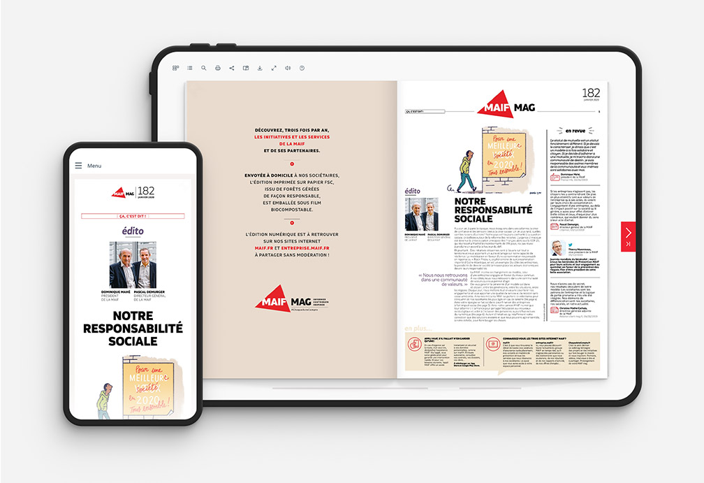
The principle is to create, from your original PDF, a second PDF file dedicated to mobile devices, in which all the content is displayed in a single column on one long scrollable page. Body text is large by default, and no more than 40 to 50 characters are displayed per line for optimum comfort. Exactly like a mobile website... but for a fraction of the cost of developing a responsive site. The end user enjoys an optimised experience, whether viewing the document on a desktop PC or on a smartphone. With the same link, the version best suited to their screen is displayed automatically.
The designers in the Fluidbook team can create the Mobile First PDF by adapting the design and content of your original PDF. Communication agencies can also prepare the two PDF files themselves by following a few simple rules (in that case we act as advisers and supply a document summarising the rules to follow).

The design rules are the same as for a mobile site:
- Increase the height of the page as much as necessary.
- Streamline the margins to optimise readability on a small screen.
- Only use font sizes that can be read without zooming.
- Place images within the body of the text.
- Reflow paragraphs into a single column. A line should contain 40 to 50 characters. To make reading easier, avoid hyphenation and use left-aligned text.
The gain in comfort and readability is enormous.
Fluidbook is the only provider on the market to offer the Mobile First option. This innovation was previewed in early 2020 with our most loyal clients, and has already won over many agencies and companies, including Groupe Renault, LVMH, Nexity, MAIF and Mirakl.
To see recent examples, visit this page.
Planning an interactive catalogue? Give your readers the most comfortable reading experience, whatever the size of their screen. Contact Fluidbook to discuss your project!

