By using this website, you accept the use of cookies in order to provide you with an optimal browsing experience and to collect information about use of this site.Learn more
Choose a player that suits you

Choose a player that suits you

With fluidbook, the user interface (UI) adaptations are endless. Menu items can be shown or hidden, features can be tweaked, and all the graphical objects are adapted to fit your visual guidelines. On top of all this, you can also choose which player you prefer for your project.

Players include everything outside of your content. They hold the navigation features, such as the menu, search field, seek bar and previous and next buttons. They are also defined by the way we animate when navigating between pages. Each player presents your content differently, giving the same content a different look and feel through design and animations.

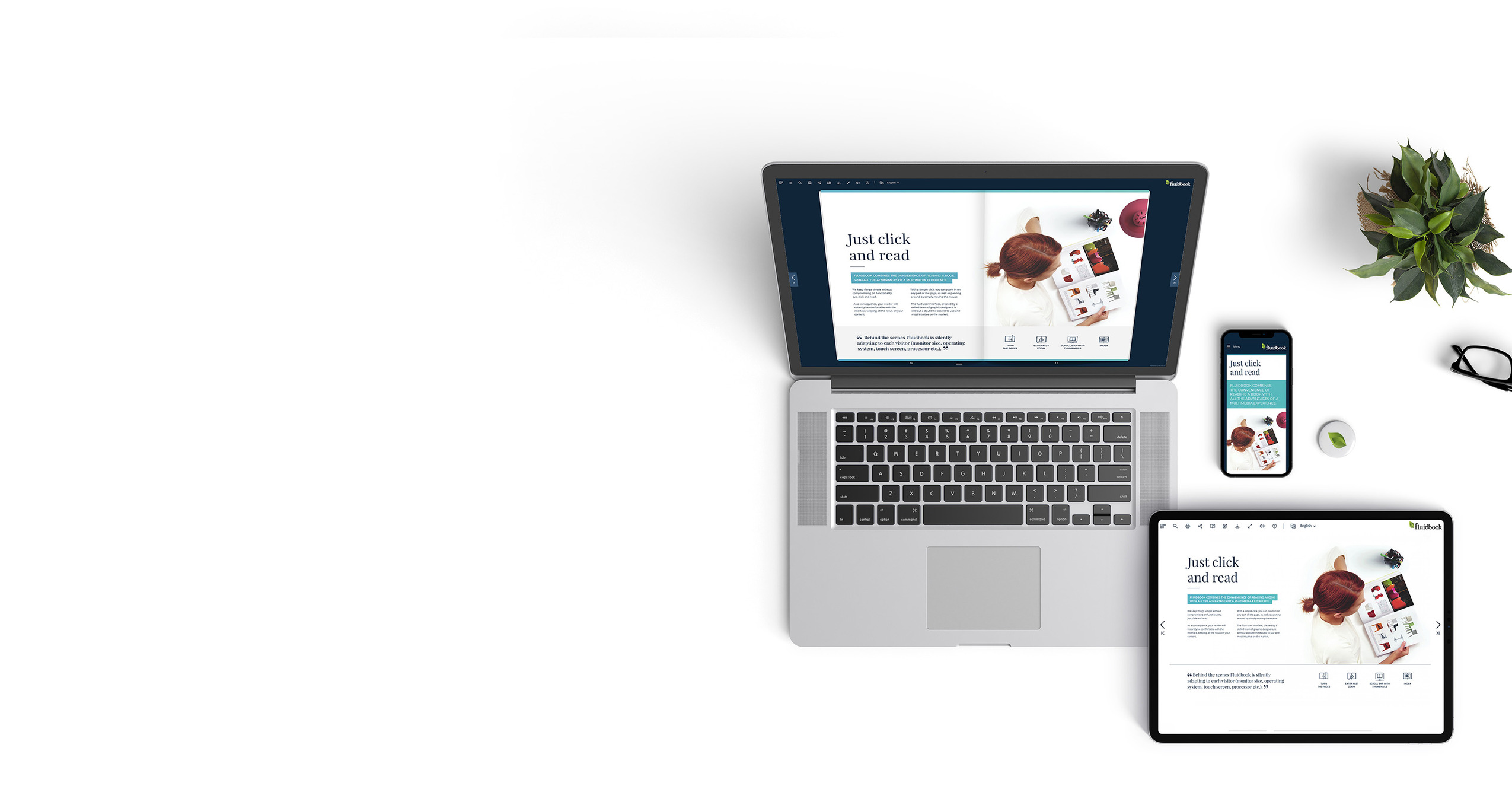
You have several players to choose between (flip, slide, air), including a mobile-first version if your audience mainly uses mobile phones. All work perfectly with any content, and they are all responsive to be viewed on any device. One is not better than the other. They are just different, and the best one is the one you prefer.

FLUIDBOOK - FLIP

If you like the touch and feel of a book or a magazine, then this is the player for you. Pages both flip softly (GPU powered real-time 3D) and sounds like actual paper pages. Our team has put all their energy into recreating a digital version of reading your favourite book, and we are proud to say that there is nothing else like it on the market.
See an example

FLUIDBOOK - SLIDE

If you are a fan of PowerPoint-like presentations, then this is the player for you. When combined with all our interactive features, you get an online superpowered slideshow. And yes, pages are sliding =)

See an example

FLUIDBOOK - AIR

If you believe that less is more, that space help to focus on the essential, then this is the player for you. Your content floats freely on the screen using a stripped-down UI and flat background colors that can be defined for every page. Transitions are smooth and delicate.
All the attention is on your content, nothing more and nothing less.

See an example

FLUIDBOOK - MOBILE FIRST + HYBRID

With the exclusive MobileFirst option, we adapt the layout of your publication to the requirements of smartphone screens. The result is an incomparable reading comfort.
The mobile-first player is a bit special. It can be used in parallel with one of the other players, then only showing when the user is navigating on a mobile phone.
If you need help, our experienced designers can create the Mobile-First model based on your original PDF. Do not hesitate to contact us!

See an example
Contact us

Contact us

Does your company have an interactive publication project? Or for one of your clients?
Give us a few details and we will get back to you within 48 hours with a budget and timeframe.

Chargement

Loading. Please wait...