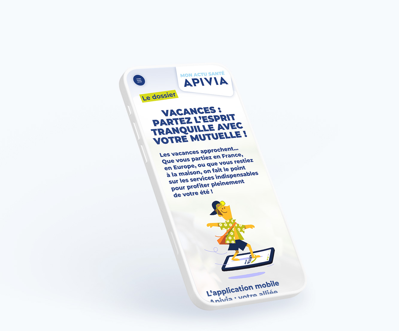
A reading experience built for smartphones
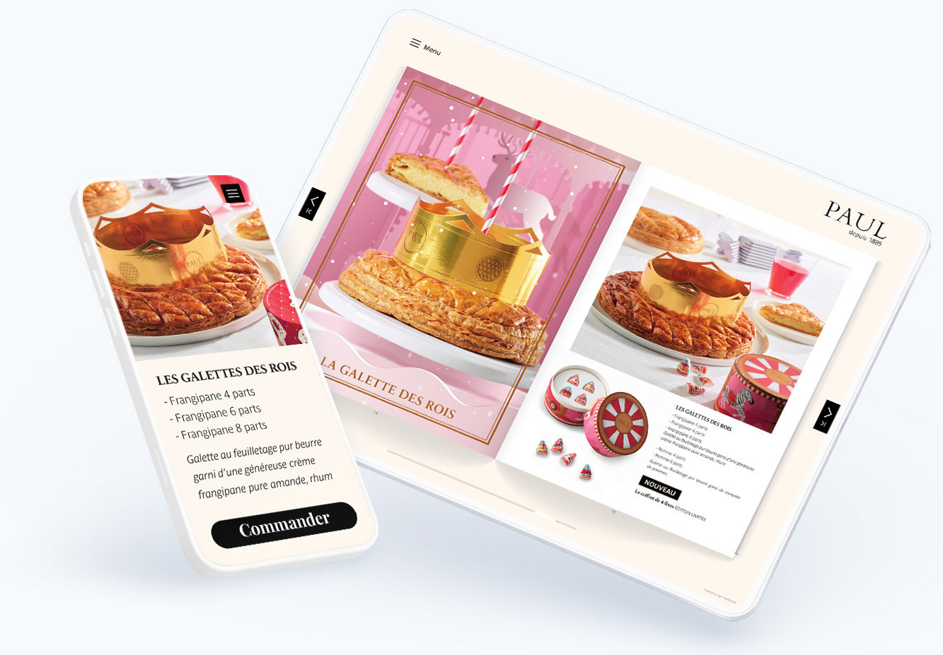
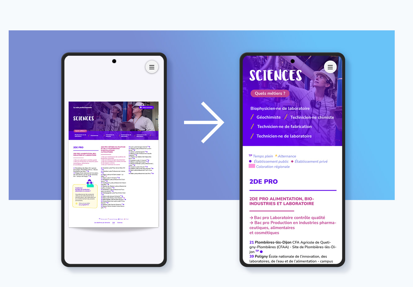
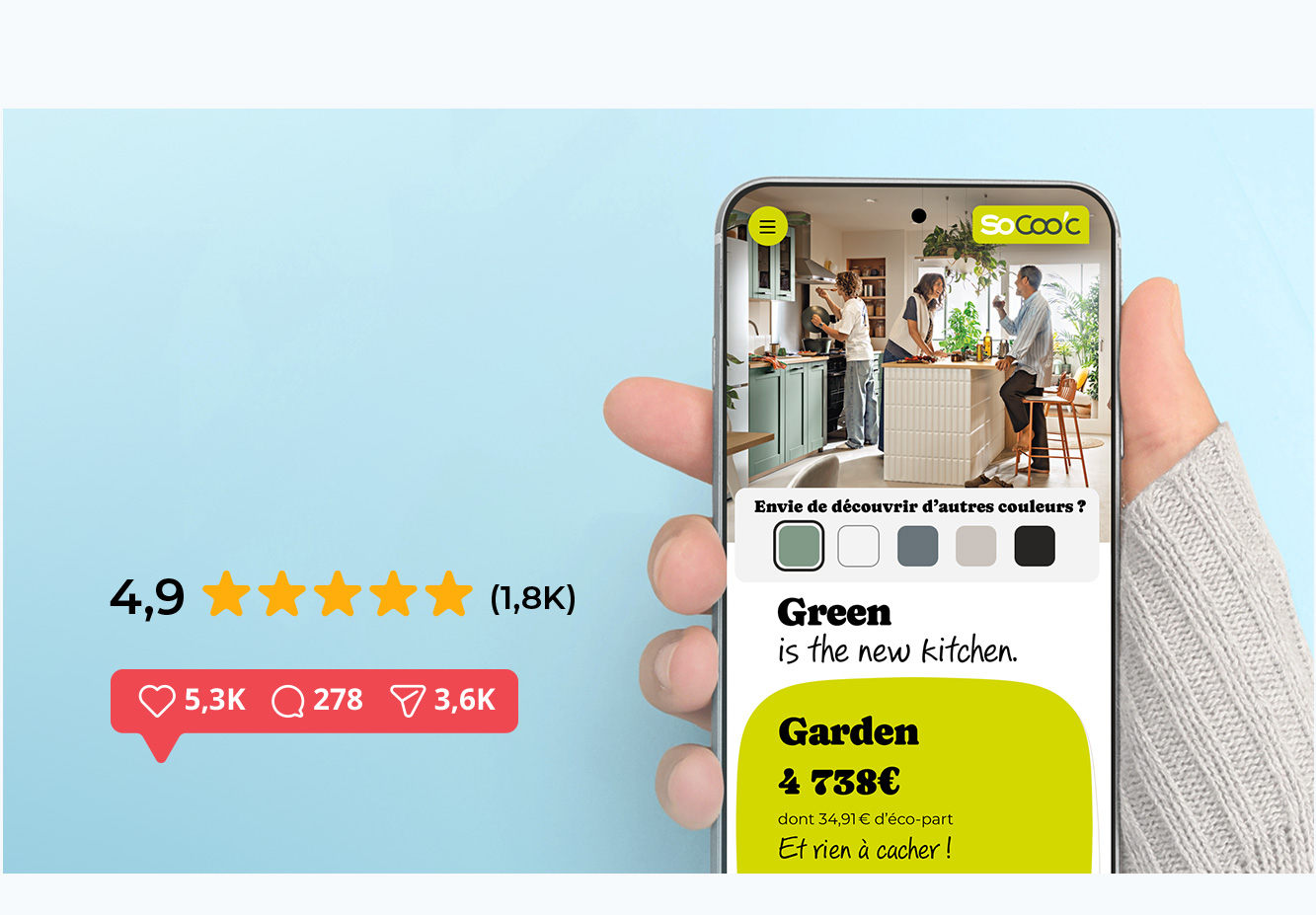
On a small screen, a layout designed for an A4 page or a double-page spread quickly becomes hard to read: tiny text, cramped columns, constant zooming... With the Mobile First option, every page is reorganized into a single column, with enlarged text and rearranged visuals — while keeping the graphic DNA of your original publication: colors, fonts and illustrations are all preserved in the Mobile First version.
Reading becomes natural, with a simple vertical scroll and no zooming required. Turning the page is just as easy: a simple left or right swipe.